‘Can I get my monitor to match my photo prints’, or should that be, ‘Can I get my photo printer to match my monitor?’
Either way this is a little more complex than you may realise. Unfortunately, you will never get a 100% perfect match between your monitor and your printed photos – Why? Sorry to disappoint but we are talking about two completely different types of technologies here. Controlling colour is not as simple as those coloured pencils you had when you were growing up.
Colour is very subjective and ‘matching’ from one device (think digital camera, scanner, monitor and printer) to another is not exactly straight forward. Transferring your digital image to ‘paper’ can be complicated.
First of all, think about the different types of print technologies that are available – for digital print there is inkjet, colour laser and dye sublimation amongst a few other odd ones and for traditional print there is offset, flexographic, gravure and even letterpress.
These print technologies reproduce colour by spraying, baking, fusing and even pushing colour onto the substrate (think paper) – each using a completely different method. Adding to this is the types of papers used – texture, finish and varying shades and hues of ‘white’!
Managing colour to produce accurate, predictable and repeatable results across all these print technologies is always going to be a challenge, even for the professionals.
But the good news is that there is workable solution based on the colour science that exists – If you want each of the above-mentioned print technologies to provide a very similar print appearance from the same original image Colour Management (CM) is required.
At the heart of CM is profiling or ICC profiling. Profiling captures the colour behavior and capabilities of the device and allows colour communication between devices.
Where does it start?
The International Commission on Illumination also known as the CIE (Commission Internationale d’Eclairage) in 1931 started to establish standards for a series of colour spaces that represent the visible spectrum or human colour vision. These systems are based on three co-ordinates or values and include CIE XYZ, CIE L*a*b*, and CIE L*u*v*. As best as they could at the time, studies were done in order to come up with the xy Chromaticity Diagram to define the visible spectrum as a three-dimensional colour space. The CIE found that we do not see all colours in a uniform way, so they developed a “map” that shows our range of
vision is a bit skewed.
The great thing is that we use this colour space as a reference for judging and evaluating the colour capabilities of printers and monitors.
What do I need to do? – Monitor Calibration
A good place to start is to calibrate your monitor. Calibrating your monitor involves deciding on some aim points for colour temperature (white point), brightness (luminance cd/m2), gamma (usually 1.8 or 2,2) and even black level or black point. It can sound hard but with colorimeter and software packages available for not too much it now fairly easy to start with calibrating (and profiling) your monitor.
The key point is that you should not expect perfection with monitor calibration and with monitors – you get what you pay for. We have a couple of good blogs to help with monitor calibration.
Then… – Printer Calibration and Profiling
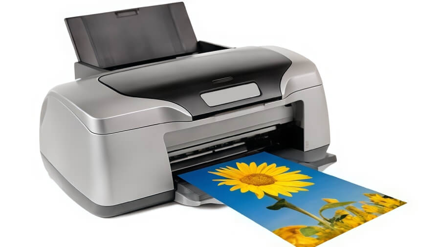
As an outline for a home/office inkjet printer you will need to go through these ten (10) steps.
- Check the printer condition (nozzle check, etc.)
- Do you have the correct paper you want to profile (you will need more then one sheet – best to have a packet of 25 sheets on hand…)
- Suitable spectrophotometer and profile creation software (software up to date? Spectrophotometer working, ok? Calibrated?)
- Select a profile chart (Number of patches?)
- <IMPORTANT> Print the chart (CHECK the print settings – usually done in through PhotoShop)
- Check the chart printed result
- Check the chart printed result
- Build your ICC profile
- Evaluate and validate your profile
- Do a test print and evaluate under the correct lighting
What else?
You can always try to use the paper manufacturers profile. They usually have profiles available for a few different types of printers using their papers or substrates – but your printer type may not always be included.
A profile made with the paper you are using with your printer; ink set and print settings will always be better – provided you follow the rules correctly.
Once you have a good printer profile, for each of these papers you use, you can use the ‘proof’ function in PhotoShop to simulate how you photo will look before printing. This is one of the big benefits of colour management – it is an enabling technology.
Applying some science to looking after colour is a good thing and allows you to take control – otherwise the colour will control you!
To realise the full benefits of printer colour calibration and digital colour management please contact us via our contact form